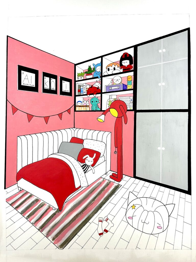
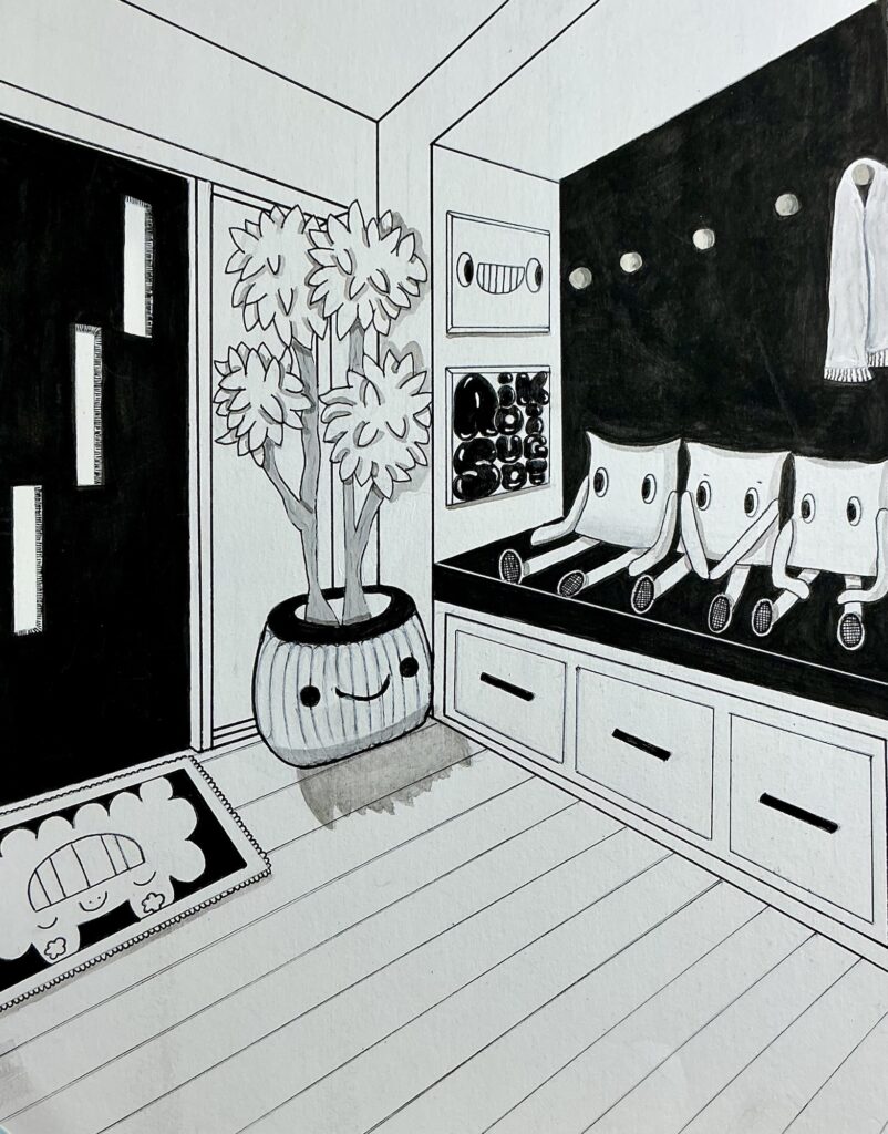
This piece has been finished for quite some time but as is typical of me I immediately started on the next one and forgot to post. The best thing about this untitled piece is how I greatly improved my perspective with vanishing points. Originally I put the vanishing points at the farthest ends of the paper because that is how I learned, but I noticed that, despite the fact I followed the rules correctly, my perspective always seemed distorted. A good example is this previous piece:
I couldn’t understand what I was doing wrong until I vaguely remember seeing a video on YouTube about how perspective points can be off the page. I’m ashamed to admit I originally scoffed at this because it seemed like a lot of work, but I wanted my work to improve so I sheepishly attempted the method that was shown and damn if the artist wasn’t correct. My perspective improved SO much! For the first time it mirrored my reference exactly.
I was stoked.
Aside from that, another breakthrough I made was attempting to use fewer colors on my pieces. There’s an artist I follow on instagram (I think I already mentioned this) who uses just 4 or 5 colors in his work and it’s incredible. Unfortunately I couldn’t quite pull off that look with this piece but I’m hoping with lots of practice I can make my color pieces look as seamless as his someday.
Well, on to the next one!